Effective Billboard Design

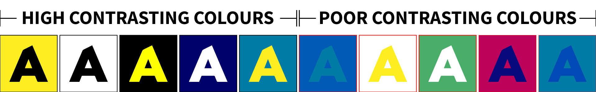
Action Media has extensive experience in designing billboards and other marketing materials. We can help you create a message that will get noticed and generate results. At least one artwork design is included with a billboard campaign and some longer campaigns include multiple designs. Some customers have their own internal design team, and prefer to supply their own artwork, which is fine too.
 
These design tips are principles that we always follow and ones we strongly recommend to customers who do their own design. These tips will ensure that your billboard ad has a high impact. 

Plain is best

Sans serif fonts are easier to read than serif fonts. A mix of capitals and lower-case letters is usually easier to read than all caps.

Colours should contrast

Some colour combinations are easy to read quickly and in any light. Others take more effort. Don’t make it hard for the audience.

Make it fun

Don’t be afraid to use humour or do something crazy if that is appropriate to your brand. The more creative and different your ad is, the more it will get noticed.

Keep it sharp

Your audience only has a few seconds to absorb your message: we will work with you to help keep your message and design focused and sharp.

Keep it short

Five or six words is ideal. Any more than ten is too many.

One photo is better than many

We will source an image that communicates something important about what you do.

Limit your contact info

Put your website, phone number or physical address. You can even put no contact information at all: people will google you.

Change it up

Digital billboards are flexible, so use that to your advantage. Change your message regularly. Just adding a different image can make your board feel fresh and new.

Less Is More

Be Creative